Corporate Design

From campaign development and large-format advertising to brochures, presentations, and social media content, each project was designed to maintain brand consistency while effectively communicating key messages to diverse audiences. Working across multiple brands and communication channels required a strong understanding of visual systems, attention to detail, and the ability to adapt creative assets while preserving the integrity of each organization’s identity.

Rapport CU Pre-merger

Before the merger, my role focused on developing campaign visuals and communication materials that could be shared consistently across multiple channels. Working within the established Rapport Credit Union brand, I created adaptable design templates that could be scaled across print and digital formats while maintaining a cohesive visual identity.

Campaigns were often developed by balancing clear messaging with modern visuals intended to resonate with younger audiences. The use of Rapport’s bold blue and green brand palette, paired with lifestyle photography and simplified layouts, helped create approachable and engaging communications while remaining aligned with the organization’s professional image.

Print & Environmental Applications

Many campaigns were designed to be experienced first within physical branch locations. Large-format posters, counter displays, informational signage, and promotional materials were developed to attract attention while communicating key products and services clearly.

Special attention was given to hierarchy, readability, and visual impact, ensuring campaigns remained effective across different sizes and placement environments.

Campaign Design System

A key part of the process involved creating visual frameworks that could be adapted across different campaign touchpoints. Rather than designing individual pieces in isolation, campaigns were built as flexible systems that could be extended to posters, branch signage, digital screens, social media graphics, and web assets.

This approach ensured consistency across customer-facing communications while making future campaign rollouts more efficient and scalable.

Social Media Adaptation

Once campaign visuals were established, they were adapted into social media formats.  Designs were adjusted to accommodate mobile viewing while preserving the visual consistency established through print materials.

This allowed customers to encounter the same campaign messaging regardless of whether they interacted with the brand online or in person.

Additional Brand Communications

Beyond campaign development, I also designed a wide range of supporting communication materials including brochures, product guides, informational booklets, presentations, annual communication pieces, branch collateral, and other customer-facing assets. These materials helped maintain a consistent brand experience across every stage of the customer journey.

Rapport: A Division of WFCU Credit Union

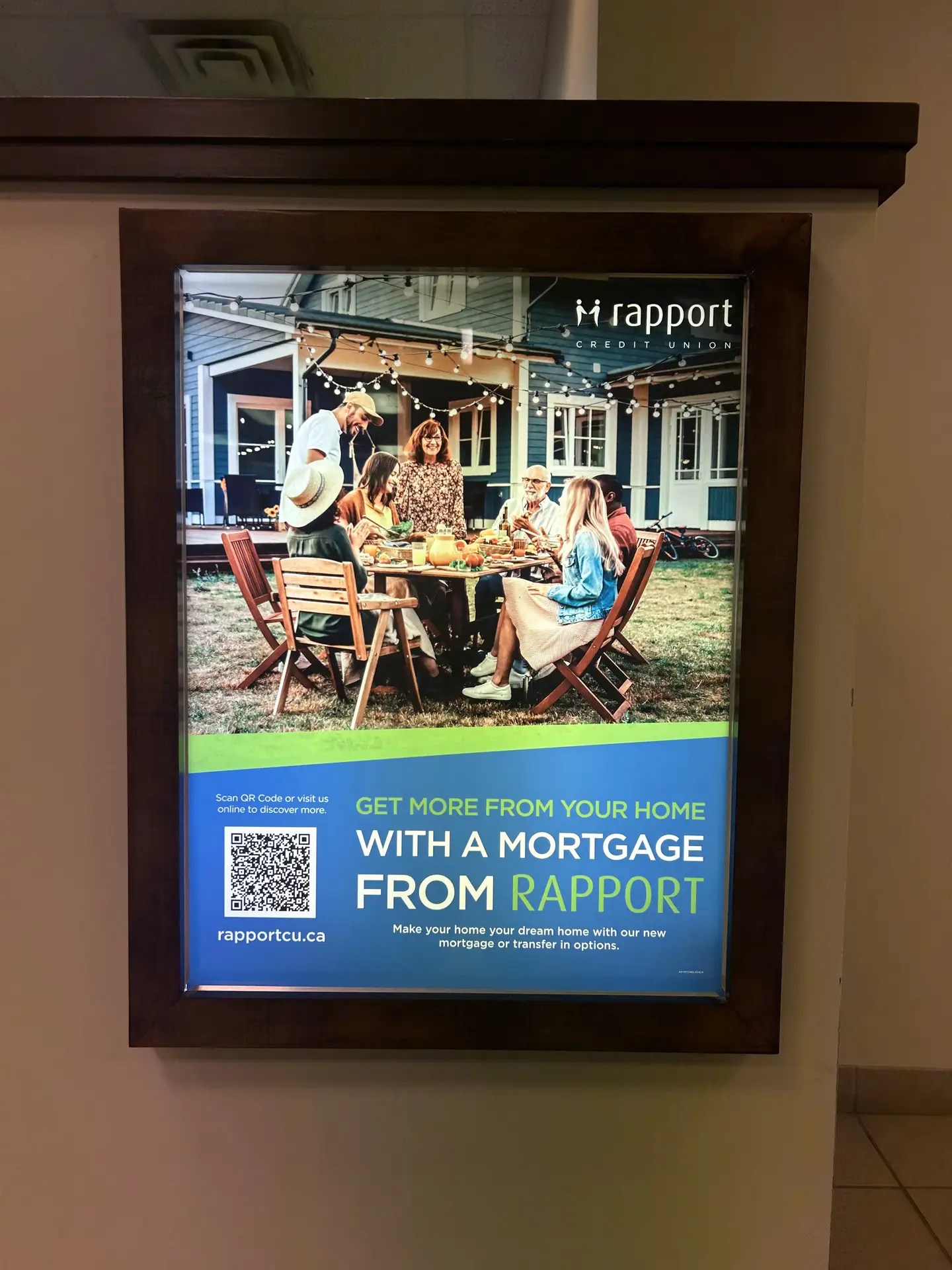
Following the merger, my role shifted from developing campaign visuals to adapting existing creative assets across the different brands and communication channels. Working within a larger organizational structure required maintaining consistency while respecting the unique visual identities of Rapport Credit Union, WFCU Credit Union, and ECU Credit Union.

A significant portion of my work focused on resizing, reformatting, and adapting existing campaign artwork for various digital and print applications. 

This role required a strong understanding of brand governance, attention to detail, and the ability to balance consistency across multiple visual identities while supporting a wide range of marketing initiatives.

In addition, I created social media content tailored to each brand’s audience while ensuring all communications remained aligned with corporate standards and marketing objectives.